Microsoft PowerPoint, Google Slides, and other slide presentations have become an absolutely essential part of any presentation.
They’re easy to use, offer a great way to combine images, video, and text, and require almost no training.
So, why are so many presentations so boring?
All the elements are there for creating effective, eye-catching, and engaging presentations, but so often we’re forced to sit through slide after slide of overcrowded, hard-to-read text and fuzzy (or non-existent) images.
In this guide, we’ll show you how to make your presentations dazzle with just a few easy tips.
How to create a PowerPoint presentation
Your slide deck has the power to add to or take away from the overall effectiveness of your presentation. Learning how to make a presentation more interesting requires skillful collaboration between the strength of your content and knowing how to make your slides look good.
So, before you open PowerPoint, let’s go through some basics.
Less is more
Less is more with slide content.
Your slides should not be stuffed with content, especially text-heavy content. Incorporating bullet points helps your audience follow your message without getting distracted by trying to read the slide.
Use engaging slide designs
You don’t have to start from scratch with every presentation! Chances are, you are not a graphic designer so why not use the templates that have been created by professionals?
Using presentation templates can help you make PowerPoint slides, Google slides, or slides for other platforms as well without spending too much time trying to create a professional look.
You can easily find templates online through Slidesgo and Slidescarnival for Google Slides and for PowerPoint. Each of these platforms offers themes within their software as well.
All you’ll need to do is make minor adjustements to the design!
Be on-brand
Using consistent branding is an easy way to build familiarity and trust with your audience. If you have an established brand in place be sure to use it when building your slides.
The colors and fonts used in your design should always adhere to your brand standards without deviation.
If you don’t have a brand guide to work from, select a specific color palette, using color theory to ensure the message of your presentation is not counteracted by your color choices.
Stick with just a few colors, and go the same route with fonts. Only choose a few to use, and avoid overly scripted options as they are difficult to read on screen.
Use visual aids
Visuals make a huge difference in your presentations. But there are a few rules to follow.
Stick with high-quality images. Adding images to your slides that are blurry, pixelated, or otherwise low in quality is an easy way to quickly disengage with your audience.
If you don’t have access to high-quality branded photos, use sites like Unsplash and Shutterstock.
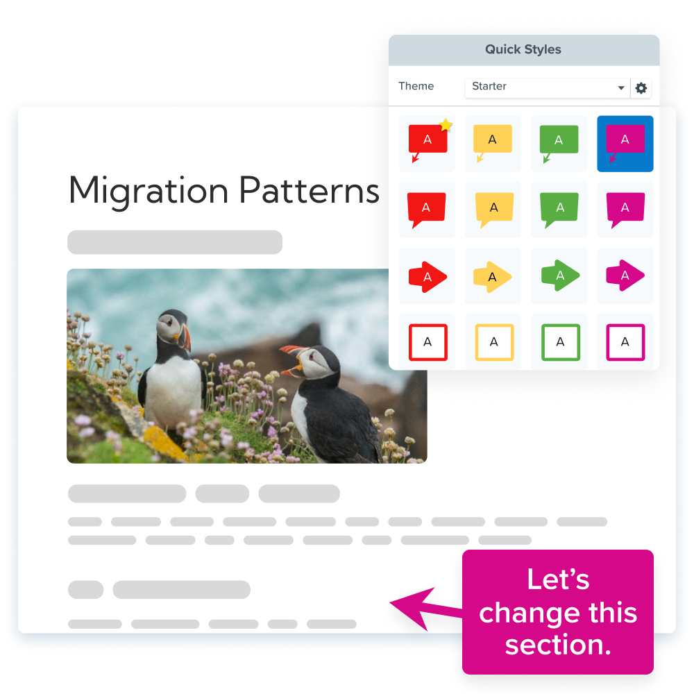
Plus, adding screenshots can make your presentation more interesting than stock photos.
Annotate and edit screenshots with Snagit
Professional mark-up tools and powerful features make it easy to create helpful images.
Try it Free
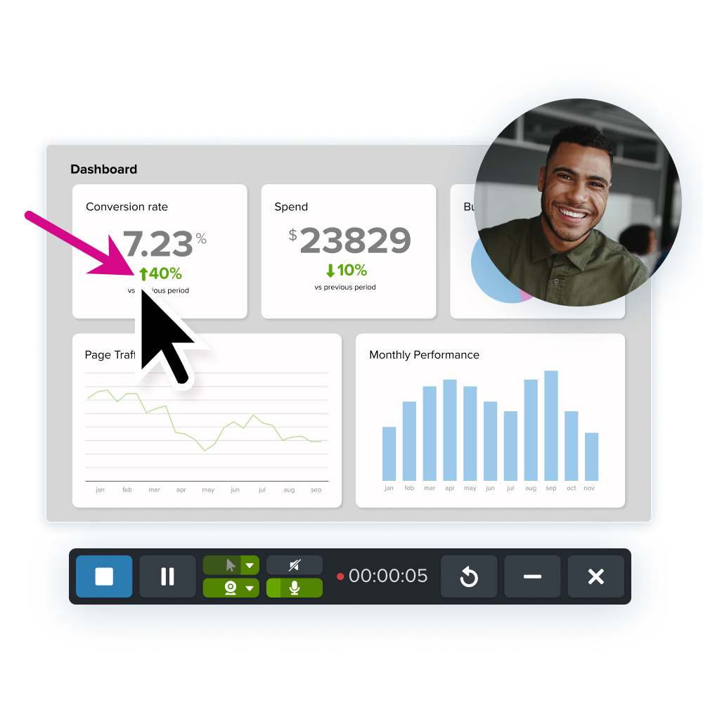
Share data analytics or upcoming project plans by taking a simple screenshot. Screenshots are the perfect addition to your presentations.
Third-party tools like Snagit are made just for that. You can add callouts, arrows, and other tools that draw your audience’s attention.
For a more fun visual, use GIFs to highlight some key points.
GIFs are a great middle-ground option between static images and videos. They can be used effectively to drive home a specific point or to highlight a specific piece of data.
Visuals always help with memorability and GIFs usually include a touch of humor and personality – both qualities that help information stick.
You can make your own GIFs using Snagit so that they are perfectly catered to your presentation.
Add videos
We live in a video world. Embedding videos directly into your slides can play a role in creating an interesting presentation.
Videos can be an easy way to show a tutorial or demonstrate a process. Whatever your presentation is about, there are videos you can make or outsource that will support your point.
However, using too many videos can take away the impact your own content has. Try to stick to three or fewer videos in one presentation.
According to Forbes, thirty to sixty seconds is ideal for a presentation video.
You want your visual aids to support your presentation, not take over it. The focus of your presentation should still be you and the value you are bringing to your audience!
Video messages > meetings
Record your screen and camera with Snagit for quick updates and feedback.
Learn More
Presentation tips and tricks
For your presentation to shine, you need to combine storytelling, authenticity, and visual aids.
Basically, it’s all about what you say and how you say it.
Tell a story
Often times when we think about how to make an effective presentation, we focus on the visuals. We add animations and transitions, hoping that will keep our audience engaged.
If most of your attention and time is spent on design, you are missing out on a key element that is crucial for making presentations interesting – the story.
The best presentations draw in their viewers with a relatable narrative, but the narrative also helps the presentation to gain memorability as well.
You should be spending a large portion of your preparation time crafting your content – the actual information you will be sharing and how you will be sharing it. It doesn’t matter how good your slide designs are if they aren’t supporting compelling content.
You don’t have to weave an epic tale for your presentation, but if you are looking to make your presentation interesting you need to incorporate some storytelling aspects, like personal connection and impact.
To achieve your purpose, you’ll need an outline. That way, your purpose is kept at the center of your presentation and you follow a familiar structure. You need to make sure that you have a clear beginning, middle, and end. Just like a regular story!
Presentations that are interesting from beginning to end take the audience on a journey. Steer away from reciting facts and from long tangents. Find a middle ground that’s personable and informative!
To create an interesting presentation, be sure you structure your content in a way that makes it easy to tell the story and provide your audience with a journey that is relevant and memorable.
Be authentic and engaging
A key point that often gets forgotten when preparing presentations? YOU are the presentation.
Leslie Chamberlain, Senior Director, Customer Education explains on The Visual Lounge Podcast:
“What it comes down to. Whenever you’re doing any kind of presentation, whether you’re doing it on a video, whether you’re doing it in front of folks in person, it comes down to your audience is building the relationship with you. Your slides, your images are not the presentation. You are the presentation. So as you go forward to present, be true to yourself, speak from your heart, and enjoy every minute of it.”
Lean into the parts of your personality that best serve the presentation’s purpose. Tell personal stories, speak in the same manner you normally do, and be open. Public speaking is always a little daunting, but with confidence, you can achieve anything!
Your body language should be easygoing, so try to use natural hand gestures and smile. Make sure to maintain eye contact with audience members. It will create a bond between you and them, which will increase their confidence in you.
Your energy is contagious. To make your presentation more interesting, you’ve got to bring the right energy.
High-energy presenters get more engagement from their audiences while coming in with low energy is a surefire way to destroy any hope of engagement, regardless of how good a story you have crafted with your presentation’s content.
Memorize your content rather than relying on reading your slides, and be sure to use different speeds and volumes throughout the presentation to make it more interesting, draw attention to specific points, and present authentically.
And don’t forget to use organic visuals in your presentation to support your purpose and drive home the information you’re sharing.
Create a Video to Share Your Slides After Your Presentation
To wrap it up, you can make a video of your presentation. That way, you’ll be able to use it again in the future without going through the hassle of presenting over and over.
To do so, you can simply video record your screen and your camera. With Snagit, you can do so easily and use some fun tools like Screen Draw to direct attention to certain parts of your slides.
Record your screen with Snagit
Snagit makes it easy to share quick updates and how-to’s by capturing exactly what’s happening on your screen.
Get Snagit
Once you’re done recording and making simple edits, send the video as a link through Screencast. Hit the Share Link button to create a unique link to your video. Then, send it out to anyone who might’ve missed your presentation!
This is also a great way to get feedback on your presentation before it happens. Record a mock-up presentation using Snagit, and send it to your team for honest, constructive criticism. That way, your presentation will be so much better when the day comes!


Share