You likely know them from professional broadcasts or interviews where you see a graphic with someone’s name, job title, and other relevant information. While rooted in professional video, they are now a standard part of the video editing toolbox.

Why use lower thirds?
Lower thirds are important because they make it easy to communicate key details without interrupting the video content. Beyond helping convey valuable information, lower third logos and text, along with graphics, also help add a layer of professionalism to your videos. These aren’t just for names and titles. They are also great for a wide range of content, like quotes, locations, statistics, dates/times, and social media handles.
Step-by-step guide to creating lower thirds
Step 1: Choosing the right video editing software
Camtasia is an easy-to-use, non-linear video editor with drag-and-drop features for creating professional-looking lower thirds. You can build them from scratch or choose from a variety of pre-made templates, making it simple to get started.
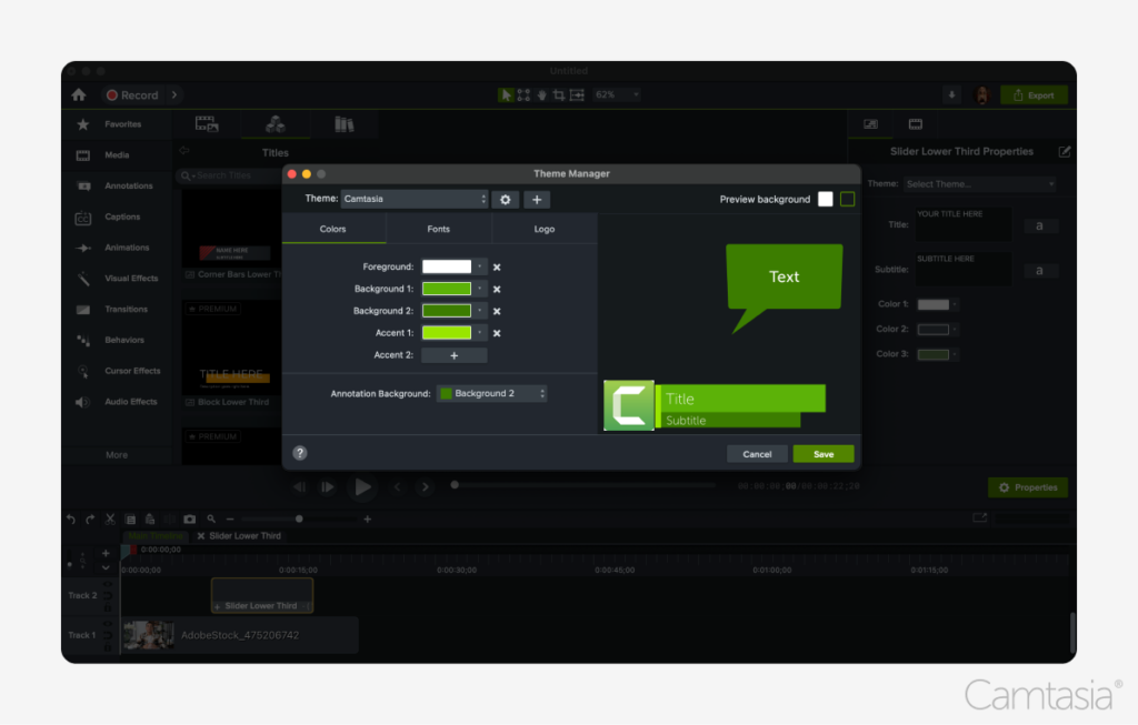
You can even create a theme to apply your brand colors (as well as other text, titles, graphics, animations, and more). In addition to titles and lower thirds, Camtasia offers a full suite of video editing tools to give you professional video quality, even if you’re just beginning your video creation journey.
Download a free trial of Camtasia to get started.
Step 2: Designing your lower thirds
There are a few key things to keep in mind when designing lower thirds:
- Take into account the size and position. Make sure it is within the “title safe area,” ensuring it is visible across all devices. This means leaving some space around the edges to account for differences in how different devices may display your content. A good rule of thumb is to keep any lower third content out of the exterior 10% of the display area.
- Keep your designs simple and clean. They should be easily readable and on-brand/consistent with other graphics. Beyond the core text/information, focus on only including basic shapes and logos that don’t distract from the primary content of the video.
- Use appropriate colors and contrast: Ensure the colors of your lower thirds complement your video’s overall design while maintaining readability. Choose high-contrast color combinations to make text and elements stand out, especially on varied backgrounds. This helps prevent them from blending in or becoming difficult to read, keeping them visually effective.
Step 3: Animating your lower thirds
Adding simple animations can help increase engagement with your viewers. But it’s important to keep these animations simple to avoid distracting your viewers. Focus on simple fade or slide animations and avoid anything that spins, bounces, or takes a long time to animate.
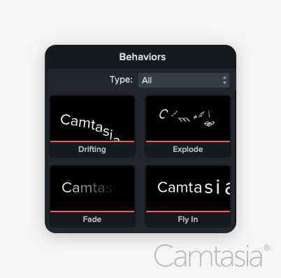
Camtasia’s built-in animation tools for lower thirds are a great way to introduce smooth transitions. You may find it helpful to start with a template and work towards incorporating your own graphical elements.
The easiest way to edit videos
Stop wasting time and discover how Camtasia Editor makes creating incredible videos easier than ever.
Free Download
Best practices for using lower thirds
Keep it simple and clean
You don’t want too much of a good thing. Be careful not to overload the lower third with too much text or graphics. Ensure readability by using clear fonts and maintaining a balance between text and graphical elements.

Mind the title safe area
Ensure these remain within the “title safe” part of the screen, guaranteeing visibility across all devices. Camtasia’s built-in guides can assist with proper alignment and placement, ensuring they look professional and stay legible on any screen.
Where to use lower thirds
YouTube and social media
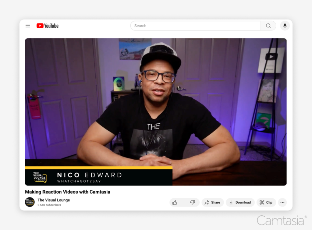
Lower thirds are especially effective on YouTube videos to highlight additional information like social media handles, CTAs, or key takeaways. Camtasia makes it easy to export videos in the right format for social media, ensuring they look great across platforms.
Corporate and educational videos
In corporate or educational settings, lower thirds can be used to introduce speakers or provide context to the video. Titles and lower thirds can transform a basic recording of a Zoom meeting into a more professional video by creating easy cut points to repurpose individual parts of the meeting. Camtasia’s template library is perfect for creating polished lower thirds in these contexts.
Conclusion
Lower thirds enhance videos by making them more professional and engaging. If you’re looking to take your video productions to the next level, check out Camtasia’s free trial to easily create these with built-in templates and animations.
The easiest way to edit videos
Stop wasting time and discover how Camtasia Editor makes creating incredible videos easier than ever.
Free Download


Share