It can be difficult to onboard users to new and complex interfaces and workflows. Too much information can easily overwhelm the user and make it difficult to keep the focus on the essential feature or functionality.
Additionally, software updates tend to be frequent. These regular updates, coupled with localization processes, can make documentation work in the software industry quite demanding for technical content creators. How can we face these challenges without having to constantly update supporting content?
What if we designed our visual content in a way that is easy to follow, and is able to withstand future UI tweaks?
Let us introduce a design technique used by TechSmith’s User Assistance team and others – it’s called simplified user interface.
Simplified User Interface: What is it?
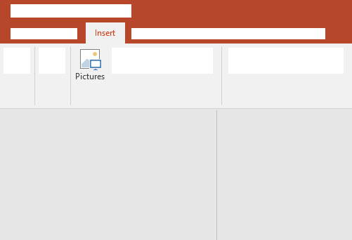
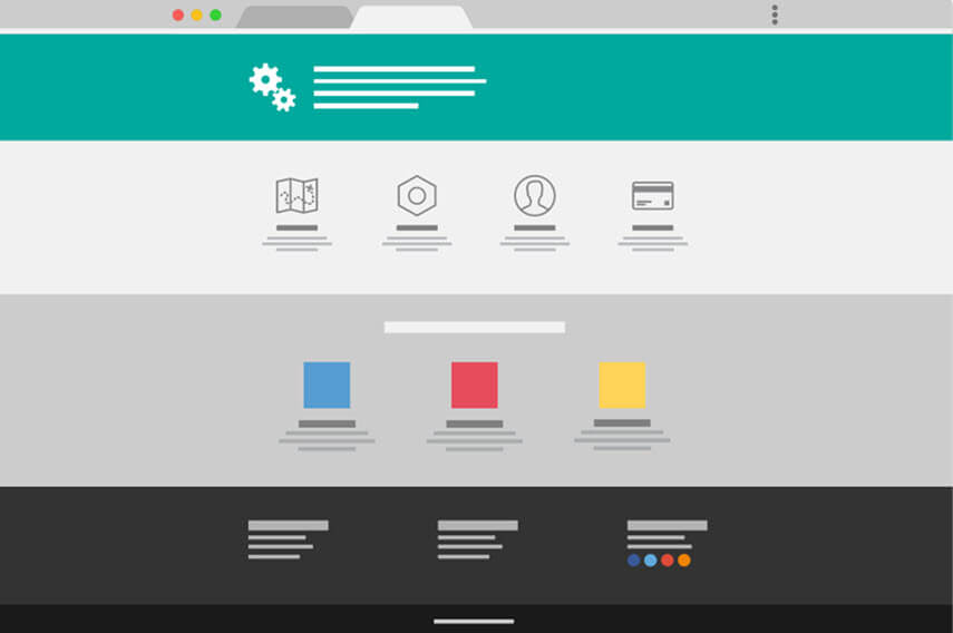
A simplified user interface (SUI) is a visual representation of a software interface that removes unimportant elements and reduces them to simpler shapes.
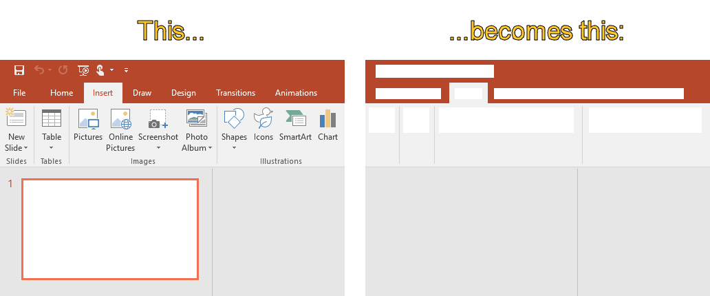
The elements that are fundamental to the instructions or for the user to understand are purposefully kept visible and the SUI graphics serves as a visual aid to support the instructional content given, via the sub- or figure text.
SUI graphics allow for easy-to-follow instructions which enable the reader to get to the point quickly and avoid distractions.
Keep it simple, Stupid!
SUI graphics leverage the famous K.I.S.S. (Keep it simple, Stupid!) principle: systems perform better if they are kept simple and when unnecessary complexities are avoided. By reducing the graphics to a simpler state and by removing distractions, we can allow the user to focus on only the essential information, which creates a better experience.
Josh Cavalier,an eLearning expert, describes cognitive load as the “amount of information being processed by the brain”. When you reduce the amount of distractions for your audience, they are better able to focus their attention on what is important.
In a recent blog post from The Interaction Design Foundation, it’s explained that a user is focused solely on how useful something will be for them. This is true for both the product design itself but also for the how-to documentation and instructions. If it’s hard to understand how to use a product, the value that it has to offer, or how a product can solve a particular problem, then users will struggle.
SUI graphics build upon these principles: using a simplified user interface in help documentation can aid in user success by giving them only the information they must have in order to be successful, increasing their success and satisfaction with a product.
Keeping content up to date
Keep your content current, longer. A quick survey with attendees at STC Technical Communication Summit revealed that keeping content up to date is one of the biggest challenges faced by technical communicators today. And that makes sense, if we look to software as an example: release cycles are shortening and new features and functionality are being added frequently. And with each feature addition and related tweaks to the user interface, the instructions that the technical documentation team laboriously put together are at risk of becoming quickly out of date, even if only slightly. So what is a technical communicator to do?
Again, simplified user interface graphics can play a strategic role in one’s content strategy. The removal of a button or addition of a feature will easily confuse the user if this change is not reflected in a precise screenshot. However, a simplified user interface graphic can often sustain multiple software versions and updates before needing further updates. The simplified design is more forgiving to minor interface changes and additions as it is already an abstract representation of the interface. Technical content creators can use this technique to extend the shelf-life of their visual content or even for repurposing content in similar scenarios.
Faster content localization
Any content creator who has been through the localization process knows that it can be time-consuming and expensive to create screenshots and graphics for each locale. Yet, the localization of onboarding materials and other graphics can be trivial for any organization that wants to be successful internationally. As Day Translations points out, we should all “scrap the idea that English is the language of business”. It’s important to cater to different customer bases by providing them with content that speaks to them…in their native language.
Most technical communicators know the effort it takes to create and manage unique screenshots for each language. In order to simplify this task, one can design the content to use SUI images instead of language-specific screenshots. The same graphic can often be repurposed across multiple languages with little to no adjustment. Additional information or instructions can be conveyed through the sub- or figure text.
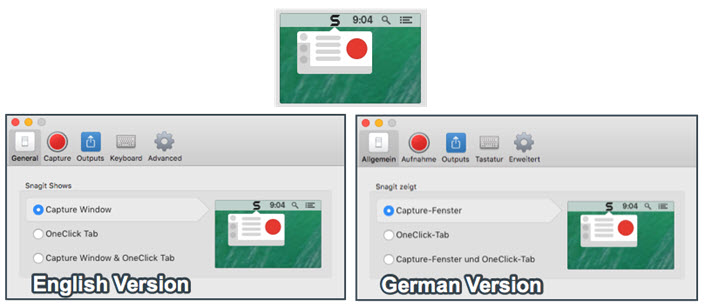
Again, this is another area that helps to reduce creation and maintenance efforts while still providing the user with clear instructions.
How to create a Simplified User Interface Graphic
Creating a simplified user interface (SUI) graphic is easier than you think. The best way to get started is to begin with a screenshot and then transform it. To do this, you need screen capture and image editing software. At TechSmith, our tool of choice for creating SUI images is Snagit because it provides both of these functions, though there are other capable image editors.
Annotate and edit screenshots with Snagit
Professional mark-up tools and powerful features make it easy to create helpful images.
Try it Free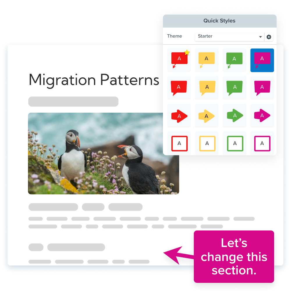
Step 1: Capture the screenshot
Using Snagit, capture a screenshot of the user interface you want to turn into a SUI graphic and open it in the Snagit Editor. Crop the screenshot to the dimensions of your desired output.
Step 2: Simplify the screenshot
Simplifying an image is a process that involves covering up and removing visual noise like unrelated text, menus, buttons, or tool tips to reduce an image’s complexity and focus attention on the important parts. Snagit provides two ways to help make this an easy process with the Simplify tool available in Snagit.
The first option is to simplify a screenshot manually by selecting the Simplify tool, and using the graphic elements to hide unimportant details in your image and direct attention to the ones that matter. After choosing the Simplify tool, Snagit automatically detects the colors in your screenshot, creates a color palette, and provides a set of tools that match and are ideal for simplifying images.
The second way option is to automate the process. Snagit’s Auto Simplify feature recognizes shapes and text and then automatically covers them with the themed elements. Remove, add, and change the color of any of the elements Snagit adds to achieve the look you want.
Watch the tutorial below to see the Simplify tool in action!
Annotate and edit screenshots with Snagit
Professional mark-up tools and powerful features make it easy to create helpful images.
Try it Free
Step 3: Save it
When you are done, save your file as a .png or .jpg file to be used in your documentation. We highly recommend also saving your final image as a .snag file. This is the Snagit project file type and it allows you to reopen the project to edit and adjust the image later on. This makes updating your image easy so you won’t need to recreate your SUI graphic every time.
Bonus Tip: Use a tag to easily access this file any time in the Snagit library.
Key takeaways
The benefits of using Simplified User Interface graphics in your technical documentation are twofold: First, these graphics visually enhance your instructions and improve the onboarding experience for your users. Second, the graphics make technical communicators’ jobs easier, as they reduce the need for screenshot updates and help with localization.
Integrating SUI graphics into part of one’s content strategy is therefore a smart business decision that all content creators should consider, regardless if your favorite aspect is the improved user experience, having evergreen content, or faster localization. Even just a few simplified user interface graphics can make a big difference!
If you aren’t using Snagit yet, download the free trial today, and get started creating your own SUI graphics!
Editor’s Note: This post was originally published in May 2012 and has been updated for accuracy and comprehensiveness.



Share