Quick-reference guides are essential for providing good customer service and a positive experience. These guides offer easy access to the information people need about a product, process, or service.
Your team can also use quick-reference guides to answer questions and doubts about the products. Guides are essential to internal and external communication, so let’s take a closer look at what exactly a quick-reference guide is…
What is a reference guide
Such documents are typically no longer than two pages and can either be detailed or super simple, depending on what’s needed.
While user manuals and lengthy documentation dive deep into the intricacies of a product, quick-reference guides are all about brevity and accessibility. They act as a bridge for users, spanning the gap between having no prior knowledge and gaining basic proficiency.
Whether it’s a list of keyboard shortcuts, a flowchart for a process, or a collection of frequently asked questions, these guides are designed with one goal in mind: to get the user up and running as quickly as possible.
With the rapid pace of today’s world, such guides resonate with users who need answers fast, without sifting through pages of information.
Why is it important to have a quick reference guide?
Quick-reference guides are especially useful when a product or service has several different or advanced functions but can also be used to perform more simple tasks.
Imagine you’re buying a fancy new stove to replace your trusty old one. The old stove had a straightforward oven—turn it on, set the temperature, and you’re good to go.
However, this one is a new, updated model. Beyond the basic Bake setting, it dazzles with options like Convection Bake, Roast, Bread Proof, and more. Instead of the old-fashioned turnknob, it has buttons and a sleek digital display.
Now, even if you’ve baked the occasional loaf of bread, let’s admit it: most days, you’re just warming up pizza rolls or crisping up garlic bread. That’s where the beauty of the quick-start guide (a common type of quick-reference guide) comes in. Provided by the manufacturer, this handy process documentation gets you up and running with basic baking in no time.
Then, when the day comes that you’re ready to dive into those advanced features, the fully comprehensive manual is ready and waiting. Quick-reference guides are like cheat sheets, helping users quickly locate the essentials.
Speed up your screenshot workflows
Stop wasting your time with built-in snipping tools, and try Snagit!
Learn More
How to make a quick-reference guide in six easy steps
Creating a quick-reference guide can be tricky without the right tools. For example, using Microsoft Word to create such a document will likely be frustrating and time-consuming.
Of course, if you have a professional designer—who can ensure your quick-reference guide looks good and conveys all the necessary information in the best possible way—on the payroll, then you’re sorted.
Snagit comes with several templates that provide professional-looking designs you can use to create quick how-to guides just by dragging and dropping different elements. Snagit will even let you add and customize different color palettes to help ensure brand consistency, which will build better customer relationships.
If none of the preloaded quick reference guide templates take your fancy, you can download dozens more with TechSmith Assets for Snagit.
Snagit has sample quick reference guide templates so you can easily create.
Step 1. Take your screenshots
First, take all the screenshots you need and make any annotations (arrows, text, etc.) you want to include in the graphic.
Step 2. Create your template
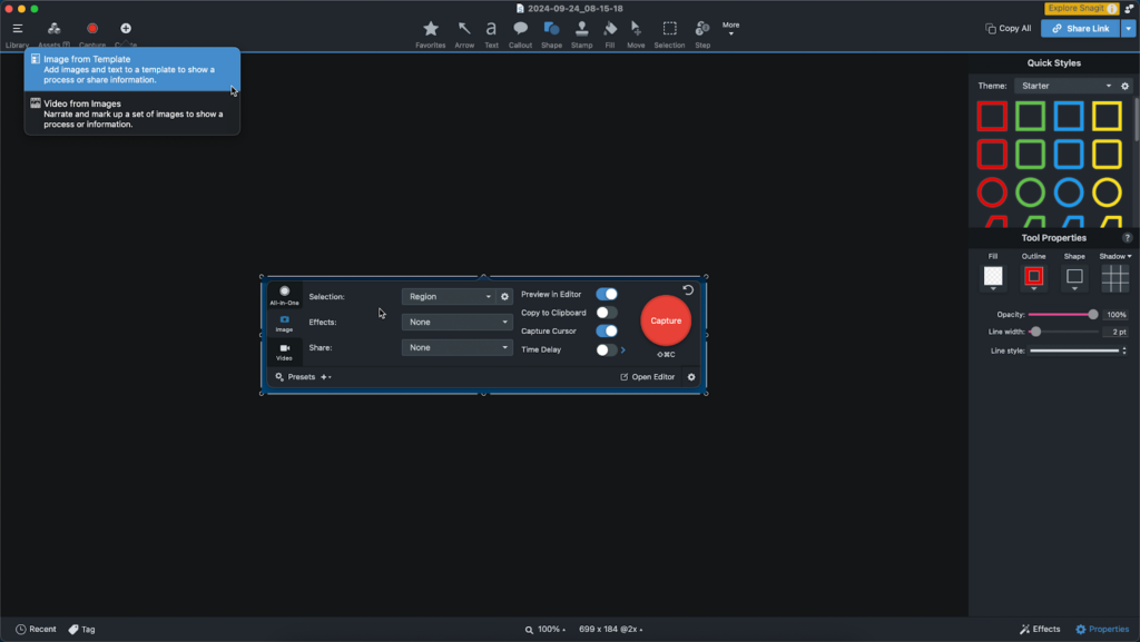
Then, in the Snagit Editor, click Create > Create Image from Template.
Step 3. Choose a template
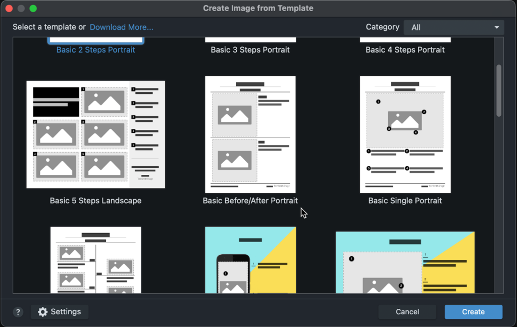
Next, select the template you want to use. Choose from plenty of quick-reference guide templates.
For this example, we chose the Basic 5 Steps Landscape. While this particular template is intended as a step-by-step guide, it’s perfect for our use case as well.
Step 4. Add images
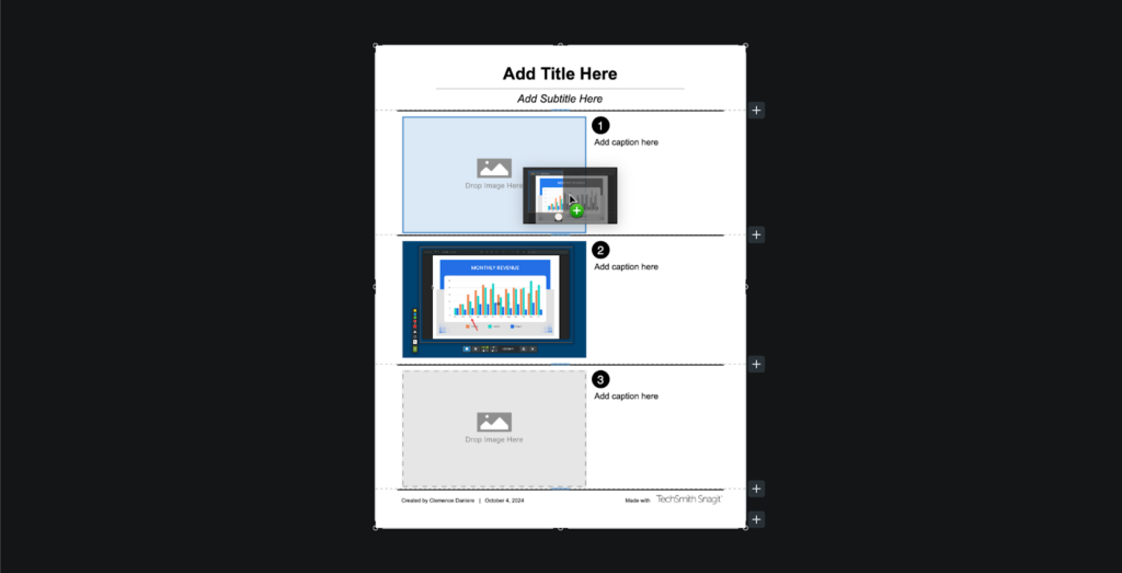
Then you can drag your screenshots from the Recent Images tray at the bottom of the Snagit Editor into the placeholders in the template.
Step 5. Resize images
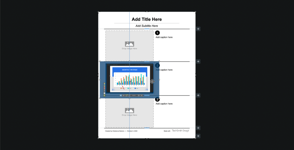
Next, resize and adjust your screenshots as needed.
Step 6. Add text
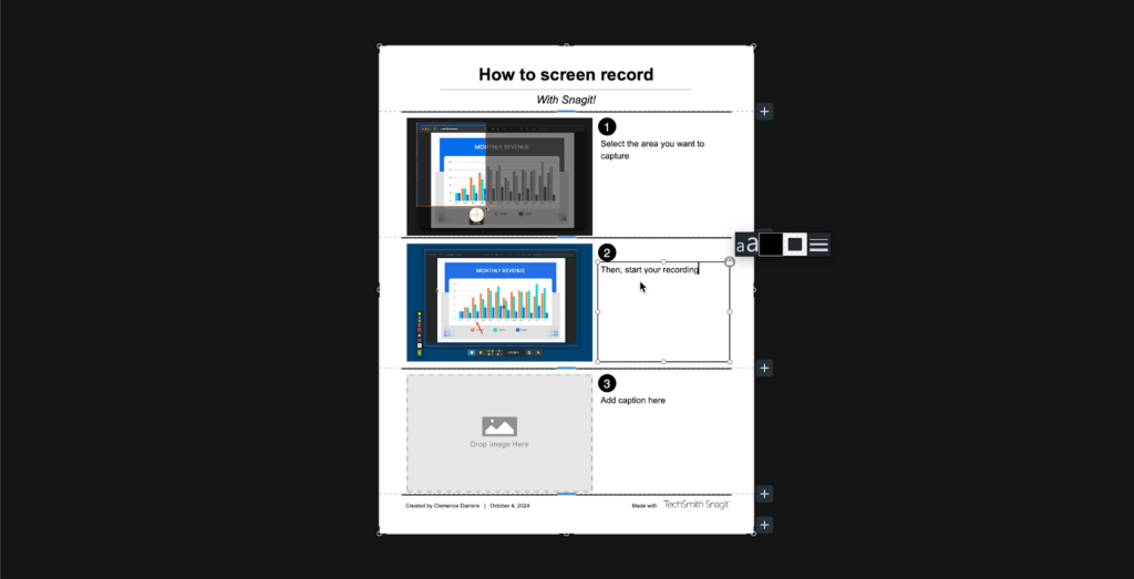
Finally, add descriptions and instructions in the corresponding sections in the spaces provided to the right of the template, and add a title in the title box. Make sure you keep it short and simple!
Common types of quick-reference guides
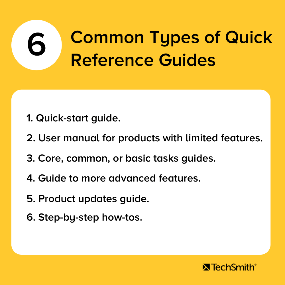
Understanding your audience’s needs is important when creating the right type of documentation for them.
For example, does your audience need a fast and easy way to get started using your product’s most basic features? If so, you need to create a quick-start guide. Or, maybe they need a one-stop reference for understanding your software’s UX? How about a glossary of common terms? Or an overview of your product’s core features?
What if the user is moving from a different software to yours? What information might they need to make the transition easier? By thinking about the differences in menu trees, icons, and feature names, you can accelerate product adoption and improve customer retention.
While all these applications may be different, the point is that the information you need to convey can be transferred with the right quick-reference guide. The key is your audience and creating the content they need to succeed.
With that in mind, here are some quick-reference guide examples with a breakdown of how they’re most commonly used to help users:
- Quick-start guide
Help your users get up and running quickly with your product. - Core or basic task guides
This is similar to a quick-start guide, but offers an overview of how to use your product or service’s most basic or core features. - Guide to more advanced features
Once your users are ready to take things to a new level, use a quick-reference guide to introduce them to other functions and features. - Guide to product changes
Has your software had a major update? Use a quick-reference guide to walk your users through the changes. If the update is major, you might even consider simplifying the user interface in your guide. - Step-by-step how-to
Got a process you need to explain? Outline the process one step at a time.
- User manual for products with limited features or functionality
If your product doesn’t require a huge manual, a quick-reference guide may be all the documentation you need.
Annotate and edit screenshots with Snagit
Professional mark-up tools and powerful features make it easy to create helpful images.
Try it Free
Essential elements to creating a great quick-reference or quick-start guide
Know your audience and their needs
Any user documentation you make needs to include the information and specific tasks your intended audience wants to know.
As noted in our Beginner’s Guide to Customer Content, there are a number of ways to figure out exactly what your users need to know. Looking at online forums, using customer surveys, and even speaking to your technical support staff are all great ways to understand what your customers believe is missing.
Regardless of how you get this information, delivering the content your customers want and need will go a long way to ensuring the success of your quick-reference materials.
Simplicity is key
The whole point of a quick-reference guide is that it’s quick. This means making information easily and readily accessible, so it’s important to ensure it’s easy to understand. Here’s how you can do that…
- Use visuals
Visual communication matters, so avoid blocks of text as much as possible. Instead, use visual elements such as screenshots with markups, icons, and product photos—and just enough text to ensure your points are clear. - Include only essential information
Be sure to keep your guide between one and two pages long. Don’t try to include everything from your entire user manual—a quick-reference guide that needs a table of contents isn’t going to be that quick to reference. Make sure you only include the most vital information that the user will need to accomplish a particular task. This means boiling down complex concepts to their most basic form. Remember, you can always create more quick-reference guides to cover other important topics when needed. - Use a simple and easy-to-follow layout
You don’t have to create a work of art to make a good quick reference guide, but if your quick-reference guide isn’t visually appealing and easy to follow, your users won’t find it useful.
Creating instructions using visuals is easy. Sometimes, something as simple as a screenshot annotated with arrows, text, etc. can be enough to give someone the information they need.
Visual Content
We can’t emphasize this enough: Your quick-reference guide just won’t be as effective, engaging, and useful as it can be without good images, icons, screenshots, or other visuals.
Images draw the eye and help provide anchor points to your content, helping your users quickly and easily identify important points of information. In fact, our Value of Visuals research found that people learn better with images and text compared to just text alone.
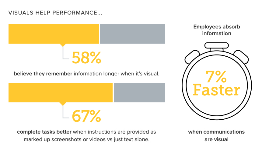
As the infographic above demonstrates, there’s some truth behind the saying “A picture is worth a thousand words.” A good image can convey a ton of information and help to reduce the text density of your content, thus making it more user-friendly.
Quick-reference guide dos and don’ts
Not all quick-reference guides will be as simple as the one we created above. Some will need more text or more images, while others will need more complex layouts.
Quick-reference guides have common dos and don’ts that are pretty universal:
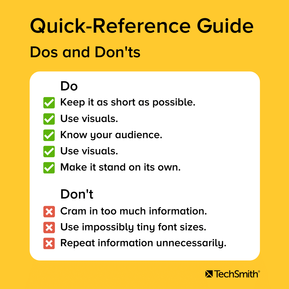
Do
- Keep it as short as possible—one to two pages is best.
- Use visuals like annotated screenshots, icons, and product & UX images.
- Use a sensible, easy-to-follow layout with clear headings and subheadings.
- Know your audience and what they need.
- Make it stand on its own. Users shouldn’t have to look in your manual to understand your quick-reference guide.
Don’t
- Cram in too much information. You’re not trying to fit your whole user manual into one guide.
- Make your font sizes so small that no one can read them without a microscope.
- Use technical jargon.
- Repeat information.
Now, you have all of the tools necessary to create a helpful quick-reference guide for your team and customers to use.
Quick Reference Guide, the FAQs
A quick-reference guide is any documentation that provides a one- or two-page set of condensed instructions on how to use a product.
Yes! A quick-start guide helps a customer or user quickly get started with your product or service without having to know the more intricate or advanced features.
– Quick-start guide
– Core or basic tasks guide
– Guide to more advanced features
– Guide to product changes
– Step-by-step how-to
– User manual for products with limited features or functionality
– Know your audience and their needs.
– Keep it simple.
– Good, clean, easy-to-follow layout/design.
– Use visual content such as images and illustrations.



Share