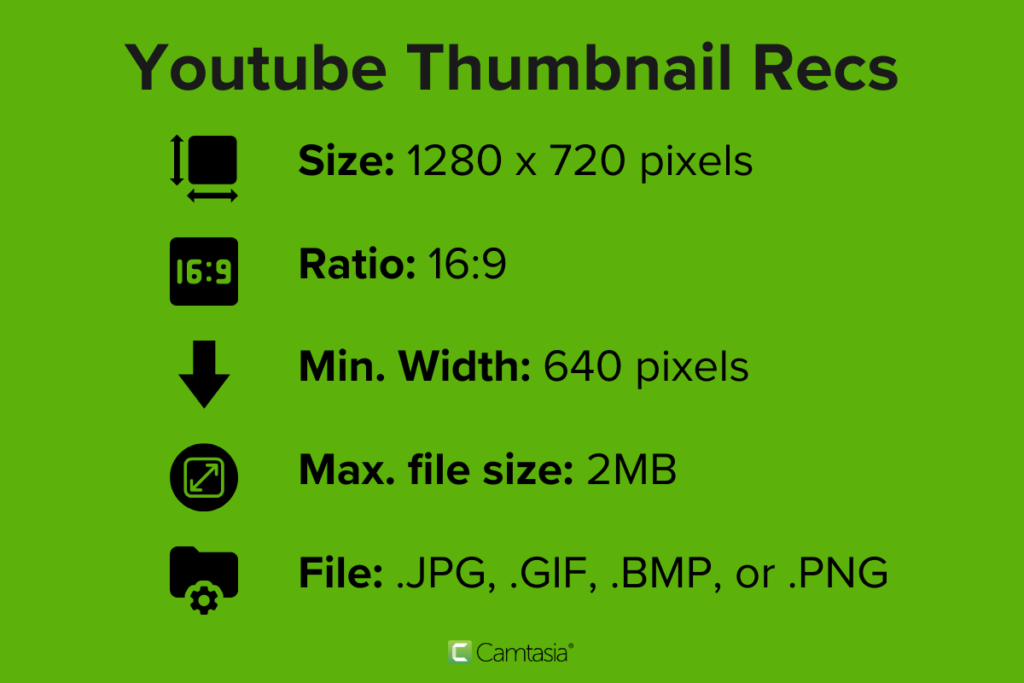
Size: 1280px x 720px
Aspect Ratio: 16:9
Minimum Width: 640px
Maximum file size: 2MB
File types: .jpg, .gif, .bmp, .png
Are you looking to get more views on your YouTube videos? While you may want to consider finding new ways to promote your content, improving your video thumbnails is one easy and effective solution to getting more clicks.
Whether it’s a learning video, a product demo, or a podcast like The Visual Lounge, your thumbnail is just as important as its title for attracting views. Thumbnails draw the attention of potential viewers and help them decide which video they should watch — hopefully yours!
In this blog post, we’ll walk you through the exact size your YouTube thumbnail should be and go over some best practices for creating your thumbnails. But first, what exactly is a thumbnail?
What are thumbnails?
Thumbnails are small versions of images or videos that give a visual preview of what’s inside the file. They originally got their name from being about the size of a human thumbnail, and in the world of online video, YouTube thumbnails are a bit like book covers.
People’s decisions on whether or not to click a video will often depend on the thumbnail. While an eye-catching image can draw people in, they’re more likely to scroll past boring or blurry thumbnails.
Ensuring your video thumbnails are better than those of other content creators will entice viewers to click on your video over others — which is vital to building a YouTube audience.
Of course, having a good thumbnail is one thing, but you still need to make sure you have a great video behind it. If you’re just starting your own online video content, we recommend checking out our Ultimate Guide for How to Make a YouTube Video.
Stardom awaits!
Camtasia is the perfect way to create exciting content for YouTube, TikTok, Instagram, and more!
Free Download
Standard YouTube thumbnail sizes
Now that you know what a thumbnail is, let’s discuss getting the perfect YouTube thumbnail dimensions.
The ideal YouTube thumbnail size in pixels is 1280 × 720, with a minimum width of 640 pixels. On the other hand, the ideal YouTube thumbnail size ratio for YouTube players and previews is 16:9.
As well as getting the size and ratios right, you’ll also want to keep in mind the file size and file type of your thumbnail. To help you get started, we’ve built this handy guide you can refer to as you create your video thumbnails:

Fortunately, some other video hosting platforms, such as Vimeo, support the same thumbnail sizes. This is great for repurposing your videos as you can post your content on multiple platforms without needing to do twice as much work. However, there are other differences between YouTube and Vimeo that might be worth learning.
Now that we’ve covered the technical details, it’s time to get creative. How do you make a great-looking thumbnail that entices potential viewers? We’ve pulled together some expert tips to help you create the best YouTube thumbnails for your content.
5 YouTube thumbnail best practices
1. Keep it simple
YouTube thumbnails are small, so be concise. And they’re even smaller when they’re viewed on a mobile device, which is extremely common since YouTube is often watched on mobile phones.
With that in mind, try not to add too much text to your thumbnails, or text that’s so small it’s hard to read. Ultimately, anything in a thumbnail that’s difficult to see or understand is a waste of valuable thumbnail real estate.
To make sure you keep your thumbnail simple, avoid adding the entire title of your video to the image — remember that the title will appear right next to your thumbnail anyway.
Use images, logos, and other visual elements, and try to steer clear of long, wordy sentences. No one wants to read a thumbnail, they want to simply see it!
You should also try to shorten your title to just a few short words, or if possible, simply use a still image with a logo. Stills are great for thumbnails because they give quick snapshots of what viewers will find in your video, without you having to create a new image from scratch.
Example

2. Use contrasting colors
We’re willing to bet that you’ve seen online videos make this tragic mistake before: white text on a light background or black text on a dark background.
Remember, thumbnails are small and there are usually a lot of them on the screen at any one time. Yours needs to stand out, so if a viewer can’t easily read the text on your thumbnail, it’s unlikely they’ll click on it.
Example

3. Pay attention to logo placement
Adding your logo to your YouTube thumbnails is always a good idea as it can help boost brand awareness. However, how and where you place your logo on your thumbnails is crucial.
Firstly, you need to make sure that your logo isn’t too large as you don’t want to distract from the thumbnail’s message. However, if it’s too small there’s hardly any point in adding it at all.
Adding your logo to the corner of the thumbnail image works well, especially if you have other text on your thumbnail, but you should always avoid the bottom-right corner. Why? Because that’s where YouTube displays the length of your video. If you put your logo there it’ll be covered up and make your video look not professional.
Example

4. Avoid irrelevant or misleading images
No one likes clickbait. That’s why it’s important to ensure your YouTube thumbnail accurately depicts what your viewers will find in your video. If it doesn’t, you could hurt your reputation or brand. But worse than that, YouTube could stop showing your videos in search results if your bounce rates are too high.
A thumbnail’s purpose is to give context, so using an image that doesn’t depict what a viewer is actually going to see won’t benefit you. It’s a good idea to find the most important point of your video and highlight that by creating a thumbnail around it. Keep it interesting and informative.
Try to create a visual teaser of your video, but without revealing too much information. The idea here is to show just enough that users want to click through and see what you have to say.
Example

5. Consistency is key
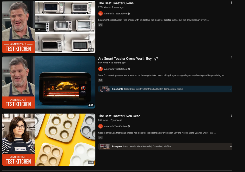
When building a brand, it’s important to keep a cohesive theme and that applies to YouTube thumbnails as well. Try to incorporate brand colors and a similar layout to your images. This makes your videos discernable to repeat viewers so they can easily recognize your content at a glance.
Example

How to make a YouTube video thumbnail
There are many ways to create a YouTube thumbnail image for your videos. Depending on your graphic design capabilities and time constraints, we’ve compiled a few options so you can create a stand-out thumbnail every time.
Whether you’re looking to create a custom YouTube thumbnail from scratch or from a simple screenshot, this guide has you covered step-by-step.
The easiest way to edit videos
Stop wasting time and discover how Camtasia makes creating incredible videos easier than ever.
Free Download
Option 1. Use a screenshot from the video
Your YouTube thumbnails need to be authentic, and what is more authentic than a still image straight from your video?
To create this type of thumbnail, take a screenshot of a clear frame of your video.

We recommend a frame that shows what the video is about in one snapshot. Try to find a clip where the speaker is leading with some sort of emotion. It could be anger, excitement, happiness, or fear.
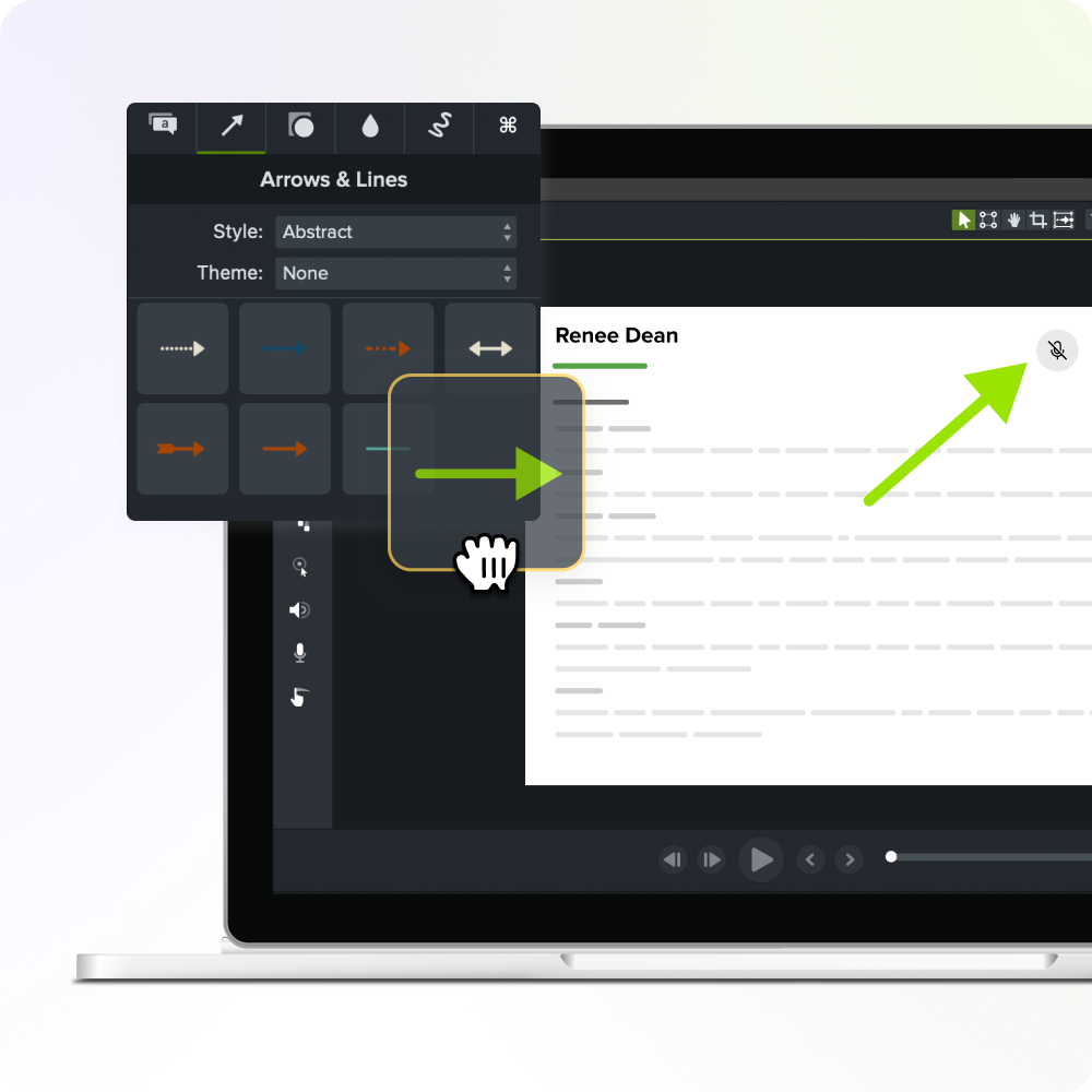
Once you’ve taken your screenshot, we recommend using Snagit, it’s time to mark up and edit. Add arrows to show off important details, boxes to highlight elements on the screen, or text that shows off the topic without taking up too much space. The key is to keep a healthy balance between the design elements in your image.
Snagit even has fun stamps that will add extra flair to your screenshots.
When it comes to including text in your thumbnails, it’s super important to keep it short and sweet. No one wants to read the title of the video in the thumbnail, after all, it will be written right next to it. Instead, include a stand-out word that explains your topic without taking up too much room.
You want your thumbnail to shine as an engaging visual, not a text-heavy box.

Option 2: Create a custom thumbnail
Sometimes, it’s best to create a thumbnail from scratch. Screenshots may not work for every video type after all. For this type of thumbnail, try to include visuals that relate to your video, even if they are not directly seen in your video.
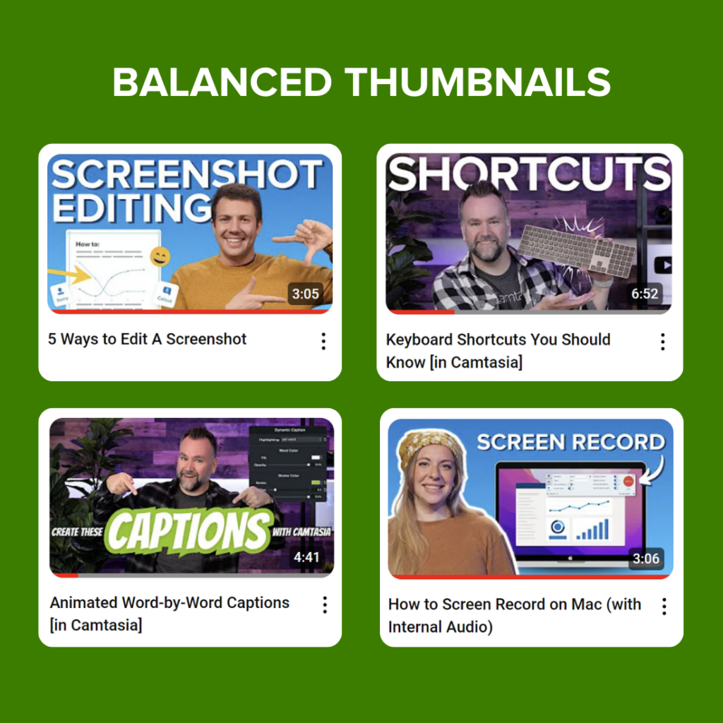
For example, a lot of creators include their face with graphics around them that speaks to the intent of the video. Our video producers here at TechSmith love this solution and use it almost every time. And there’s a good reason for it!
These thumbnails are eye-catching, exciting, and entice viewers to click on the video. Plus, they include short descriptions of the video topic while focusing on the visual elements.
To create a thumbnail from scratch, pick out elements that you want to show off and insert them into a blank canvas on a photo editing software. Any photo editing software will do, but some even provide YouTube thumbnail templates!
Then, resize, move, and edit each element until it forms a cohesive image that reflects your video. Remember to keep the text at a minimum so your visual elements can really shine! Custom thumbnail images can be more time-consuming than editing a screenshot, but sometimes the extra time can make a huge difference.
FAQ
The perfect YouTube thumbnail size is 1280 × 720 pixels. This maintains an aspect ratio of 16:9 — which is perfect for ensuring optimal visibility across most screens and devices.
Remember, the width of your thumbnail should be at least 640 pixels, anything less than that might result in low image quality.
You can’t change the size of a thumbnail directly on YouTube, since they control how it shows on the platform. But, you can upload a new and larger thumbnail, which YouTube will automatically scale down to make it fit.
You sure can! Just remember to follow the best practices for creating thumbnails — this is where the aspect ratio is crucial and you should always aim for a 16:9 ratio.
If you go with a 4:3 ratio, your thumbnail won’t cover the width of the entire screen.
YouTube can support thumbnails with a resolution of up to 1920 x 1080, but as a small image, it’s unlikely anyone will notice the high definition. Remember, you also need to ensure the file size doesn’t exceed 2MB, which might be an issue with high-resolution images.


Share